Sunday, January 27, 2013

OWH Sketch Challenge #157


Good Afternoon everyone --wow the last sketch challenge for January -- as Marlene said -- time is going by soooo fast and her mom was so right -- as I get older I do find it zips by.  And to answer Marlene's question this week- "What are you going to put in this large rectangle" --  I used another one Jolee's boutique dimensional stickers - this time it is a beautiful steampunk butterfly and the sentiment is from Stampin' Up.

Well I sure hope you all have a wonderful week -- 

Blessings,

Sharon S. 


Friday, January 25, 2013

OWH Midweek Throwdown Challenge - Easter Cards

Good Friday Morning,

It was a cloudy and rainy day here in the desert.  One of the advantages of the clouds was -- we had an amazing sunrise and I just wanted to share such a beautiful way I got to start my day.  (The pictures are below the cards if you want to take a peek)

Anyway on to the task at hand -- this challenge calls for making an Easter card.  Well I decided to try my hand at Tuesday's tutorial - the chalkboard technique.  I made two cards - one with Easter sentiments and then tried my hand at the technique on card number two.  I'm too sure about the Easter rendition but I am going to post it anyway and get your opinions.  The second card I decided to try and minimize the lettering and I think I like it a little better.  I've taken a close up of each "chalkboard" making it easier to see the "blackboard" nuances.

Well thanks for taking the time stop in and say hello.

Blessings,

Sharon S.
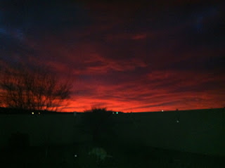


This was when I first went outside around 6 am - I thought there was a fire
the sky was so red - I don't remember ever seeing like this


This was about 20 minutes later -- it was beautiful

Monday, January 21, 2013

OWH Design Bootcamp - the ABC's of Color

Good afternoon

Well it has been an interesting afternoon -- I saw that we had a homework assignment to choose one of the basic Color Harmonies and create a card to share with everyone.  I decided -- okay I can do this..... Well.......... I got the brainy idea to make four cards using the different color schemes.  Well I did complete all four -- the jury is still out as to whether I accomplished the task -- I worked with pure colors or hues.  I did not have a large variety of card stock in the tints or tones so I just used what I had on hand.  I then decided to use one stamp set to make all four cards.   For some reason my pictures turned out darker than I would like -- I am going to go ahead and post them and if I am able to get better pictures I'll post them at another time.  So here it goes.

Thanks for stopping in -- and a special thanks for those of you that have taken the time to leave me very nice comments.  Happy crafting.

Blessing,

Sharon S.

All four that I made


1.  Monohromatic -- uses variations of tint, tones and shades

I used Hues in Violet


2. Analogous colors - colors are any three which are side by side on the 12 part color wheel -

One color is used as a dominant color and my dominant was the violet with red and red violet as accents.

3. Complementary Colors - are any two colors which are directly opposite each other.
When you choose a dominant color - there is a high-contrast and it works best if
you choose one as the dominant and the other to highlight.
I chose yellow and violet with yellow being my dominant color
4.  A color scheme based on Nature
I chose violet as my color for the flower and green like the leaves
for my main color .

Sunday, January 20, 2013

OWH Sketch Challenge #156

Good Afternoon --

I am going to make this a quick post as I am in the middle of some other crafty projects.  I wasn't going to do today's challenge but then I saw the sketch and Marelene asked "What are you going to put in that big rectangle" I knew I wanted to use a Jolee's Steampunk dimensional sticker I purchased last summer.  So I got busy and made my card.  I also explored using Tim Holtz distress stains.  I hadn't really tried them before but I am really pleased on how they added a little pizzazz to my dry embossed card stock.  I'll be exploring more with them and know I will be using them much more often.  I had to move the sentiment over to accommodate the length of the sticker and my little industrial brads and gear that I added.  I also used some copper metallic ribbon by Shaggee that I have had for years but never used until today.  See sometimes it pays to hang on to things that you might use someday.  LOL

I hope everyone is enjoying their long weekend.  I hope to get a few more cards made for OWH and in the mail this coming week.

Blessing to you all,


Sharon S.

I used S.U. card stock, sentiment and Argyle embossing folder on the blue cardstock.  On the light gray card stock I used Tim Holtz Alterations Patchwork set embossing folder.  I used Tim Holtz Tea Dye stain and Brushed Pewter distress stains on the light gray and on the blue I used just the brushed pewter distress stain.  I don't remember where I purchased the gear and industrial looking brads.
Operation Write Home Sketch Challenge #156

Friday, January 18, 2013

Paper Players Challenge 128


Good Morning -- I decided to try a new challenge over at the paper players -- it was a tough one for me -- I found I had a real hard time with bold colors.  It took me FOREVER to put anything together and I am still not sure about my card but I thought I would post it anyway.  So here it is in all its' glory -- (lol) I tried to use mostly SU items with the exception of the ribbon -- this came from my scrap basket so I have no idea of its' manufacturer and a little bling on the butterfly.

Have a great day and thanks for letting me play along in your challenge.

Sharon S.